Who wishes sometimes they’d just pop in here and there wouldn’t be a hardcore-need-a-bunch-o’-tools-and-a-ton-o’-time project going on?
Yeah, I’m feeling that way right about now too. :/
And a lot of you mentioned that you love quick tips and easy decorating ideas so I thought it’d be fun to take a closer look at what is going on in my pea brain as we get close to actually decorating a room. Hallelujah!!
As we inch ever so close to actually finishing a room the more I let my mind wander to places of fabric and accessories and decor. And the exciting part of having the entire house to complete is also having free rein to pick every singe color, texture and element that we end up surrounding ourselves with in this here space.
That idea makes me smile.
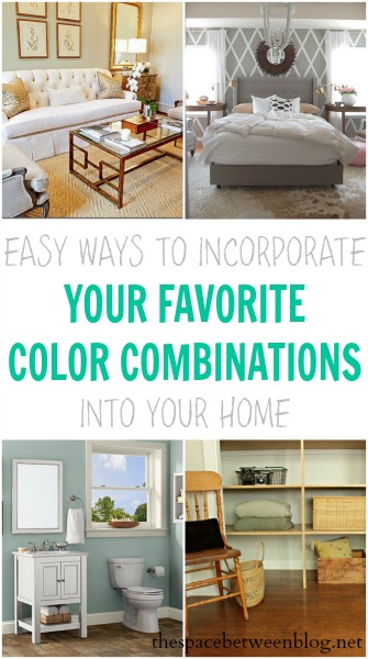
So let’s talk color and take a look at 11 color combinations I’m totally diggin’ right now and how we can all easily implement them in our own homes. And remember, when it comes to color combinations for your home, all of these principles can be implemented with whatever colors you dream about.
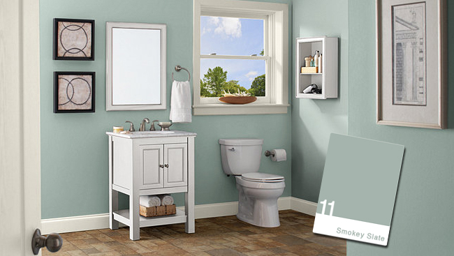
1. Smokey Slate from Home Depot – I love the simplicity of the black and white accessories with the touch of natural elements like the basket under the sink and that bowl on the window sill that tie in the color of the floor. Not that I have any reason to believe that a bowl of that size would actually fit on a window sill. Photoshop, anyone?!?!
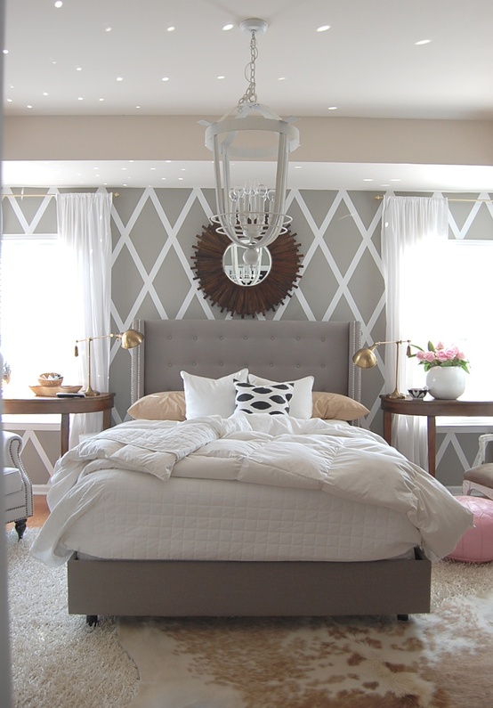
2. Neutral bedroom from The Nester – Make a statement with a fun paint treatment instead of a bold paint color. And those pops of pink are perfection, but really could be any color mixed in with this great neutral palette. Pick your favorite and pop it in there. And then find out where those sparkles of color are coming from and recreate that, because that’s super neat, too.
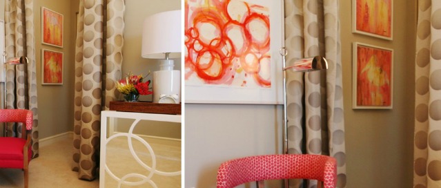
3. Pops of shades of red from Garrison Hullinger – A great touch of whimsy with the bold color and large polka dot curtains. But balanced with the sandy tone of the walls and white accessories it screams more cozy than crazy. Love the polka dots on the chair, too … I see a circle thing happening here.
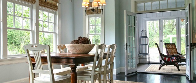
4. Aqua with wood and white from Garrison Hullinger – Actually Woodlawn Blue HC-147 by Benjamin Moore. It can be so easy to bring in natural elements large or small to balance out a color scheme. Like bamboo shades and a stained tabletop, or those fab chairs in the background, or a bowl with some twine balls in it. And I like how the light fixture brings in a warm shade of yellow for a fun eye catcher. It’s like a dream catcher only different … completely different.
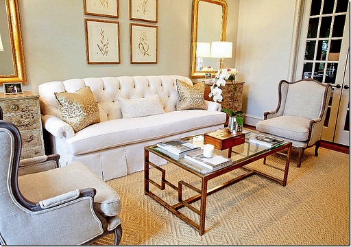
5. Dove White by Sherwin Williams with gold from Nazagreen – Recreate these elements with so many great, inexpensive products like rub n’ buff and gold leafing kits (affiliate links) to transform anything from a lamp to a picture frame, or even a thrift shop furniture piece, into the perfect metallic finish. It’s still neutral and understated but with a pop of glam. It’s like a beach with gold beads instead of sand … if there were such a thing.
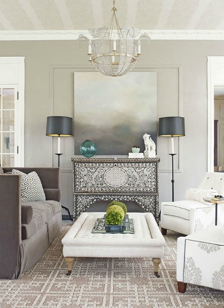
6. The full gray spectrum with pops of unmatching green from Freshome – From white to black and all shades in between, and from floor to ceiling, this color palette could work in any space. I particularly love that the pops of color, green in this case, don’t actually match, but they totally go. If you know what I mean.
And who would like to DIY that chandelier right now?!?!?!
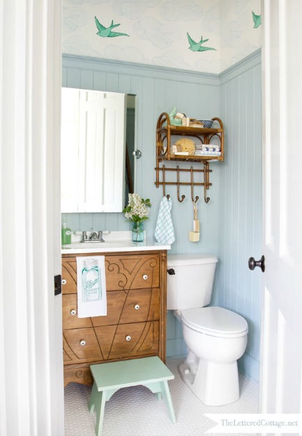
7. Wedgewood Gray in The Lettered Cottage half bath – This gray is definitely more of a blue, but again with the wood tones. I am in love with them. I think they add so much dimension and texture to any color palette you have your heart set on. And find some fun wallpaper with a color you love in it to dial-up the fun factor.
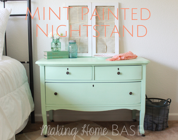
8. Olympic Sweet Pea nightstand from Making Home Base – Have a color you’re totally crushing on right now but don’t want to get all trendy and actually paint all of your walls chevron? Grab a piece of furniture and make a statement that you can drool over admire to your heart’s content … and then easily switch it up when the tides turn. It’s less of a commitment than painting a whole room, this way you’re just asking that color out for a date because you’re not quite ready to propose marriage just yet.
Looks like Making Home Base had a little one nightstand. hahahaha 😉 (I think I’m so funny!)
9. Sherwin Williams Gray Owl lightened 50% – By yours truly. Mixed with light yellows and white trim (off-the-shelf Behr semi-gloss white) , these are the colors I’m leaning towards in the guest bedroom. Joel and I have been scouring local Open Houses just to peek in on how our neighbors have updated their homes and we both walked into a gray and yellow bathroom recently and said “oooooooh, I like”.
I’m really looking forward to seeing the room come together … because it’s going to happen one night while I’m sleeping when the decorating fairy comes, right?!?! I hope she adds in a subtle pop of aqua, too.
Right now we’re working on a fun accent wall for this room and debating the importance of a bed frame.
By debating, I mean I am covering my ears and singing “la la la la” when Joel claims a mattress on the floor is the way to go right now so we can move on to another room.
I won’t have it. 🙂
And if you found any part of this post helpful, practical or just a little bit fun I’d love for you to pin it to share with your friends. 🙂
So, it turns out there is light at the end of the guest bedroom renovation tunnel and if you want to check out any part of what we’ve accomplished so far, have a look.
- the unexpected beginning
- the unwanted math challenges
- our saving grace
- the dreaded double drop ceilings
- the 6am Saturday morning wake-up call
- bringing in some light and some wind
- my $14 wall repair
- drywalling the ceiling with only our own 4 hands
- butt joints and mud
- renting the wrong floor sander
- repairing termite damaged hardwood floor boards
