This post may contain affiliate links which won’t change your price but will share some commission.
So, which end of the paint color picking spectrum are you closer to?
The ‘any ol’ color will do’ or ‘I can’t paint anything until I find just the right shade of perfect’ end?
I would have said I was closer to the end where as long as I liked the color I was fine with it … until this house. I’ve never really been stuck with analysis paralysis when it comes to paint, but I have two strategies that have worked basically fool-proof for me over the years.
Here is my take on how to pick paint colors like a pro.
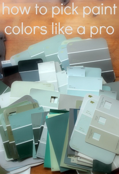
Strategy #1
For the two homes we’ve previously purchased and lived in I found a paint card that I liked and picked all different colors off of that one card except for one accent room.
Easy peasy. It creates a nice cohesive look throughout the house and really took the stress out of the whole process for me.
For our first house I went shades of beige. AHHHHH! Should I shudder in shame? Well, the way I look at it is that it was the perfect place to start for us. It was our first house, we knew we would need it to appeal to the masses for resale and I really thought (at the time) that the dark Jute tone we painted the dining room was really going out on a limb colorwise. And our accent room was grey.
When we evolved to our second house I went with another earth tone, more in a green color spectrum. The nice, light Fennel color was perfect in the kitchen and bright (with lots of windows) family room and the darker shade was nice in the living room and guest room. We had a cute little sun room off of the living room that we painted a great shade of sky blue (I think we’ll use a similar color here) and we even added a second ‘accent’ room, the third bedroom that I used as a craft room in this yellow color.
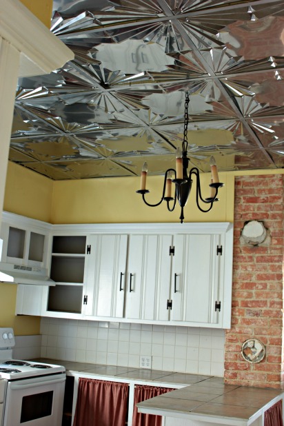
Honestly, I didn’t like the color in the bedroom, but the leftover paint was the perfect touch for this kitchen upgrade.
Strategy #2
If you’re living in a rental and want to update the color, but want to do it on the cheap, I use the easiest strategy of all. Anything on the mistint table will do. 🙂 And, I stock up when I see light shades, because they mix well with any color and you, more often than not, need more than one gallon for a room and chances of finding multiple gallons of the same color on the mistint table are slim. So, keep those light shades on hand and then just mix with any color you find that will work.
Obviously, this strategy isn’t for anyone who is super particular about paint colors.
Strategy #3
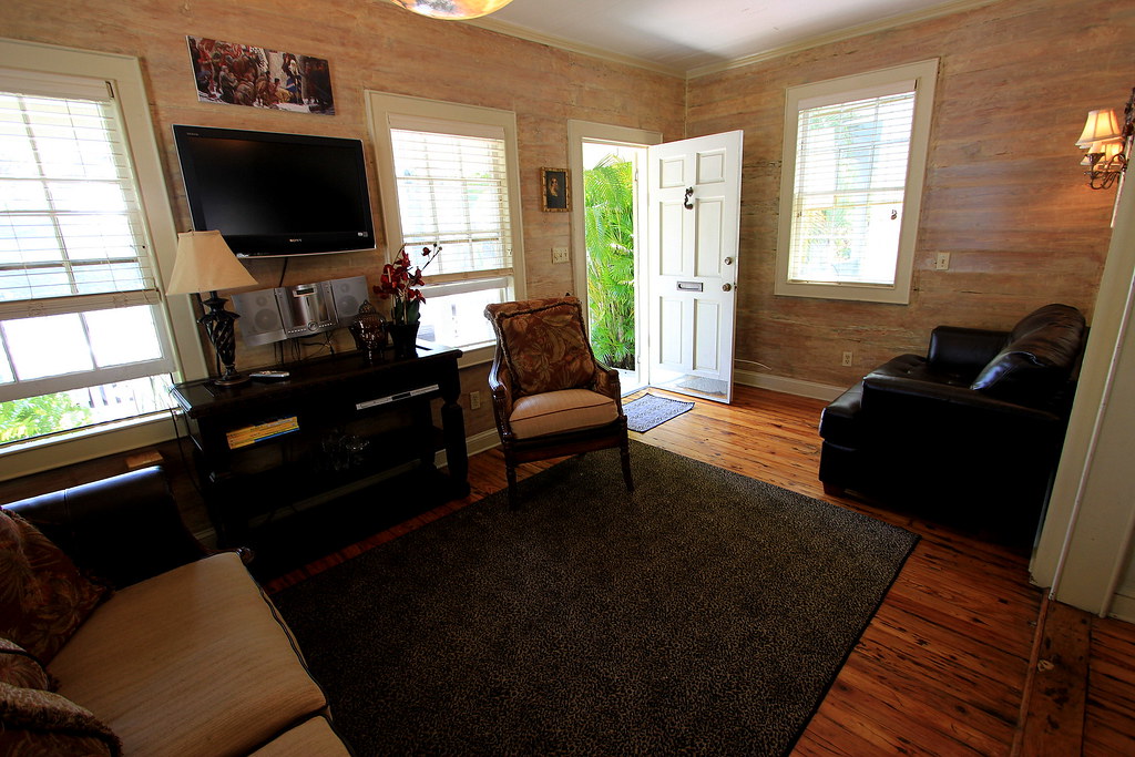
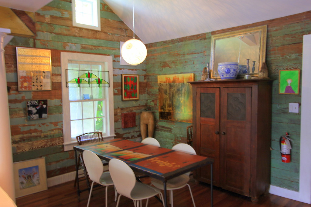
My new, untested strategy that I’m trying here in Key West … visit a lot of open houses for homes on the real estate market and see what I like. 🙂 It may seem silly, and even somewhat remedial, but we are working with a lot of old architecture and charm with the Dade County Pine walls and ceilings, and we’re hoping wood floors. We really want these features to have the spotlight, and not a paint color.
So, we decided a fun way to peek into our neighbors’ houses get inspiration for looks we love with Dade County Pine is to see what others are doing. 🙂 So far I’ve learned that if we’re going to paint the wood, I really like the lighter shades, almost just a tinted white. That leaves us open to strip a few walls and have fun accent walls without be overwhelmed by wood everywhere.
Here are a few fun looks we’ve seen.
Wish us luck. 🙂
I’ve also enjoyed reading these other great resources that you might find helpful.
10 tips for picking paint colors by HGTV.com.
Favorite tips and tricks for choosing a paint color by The Creativity Exchange
How to pick paint colors by Domestic CEO
How to choose the right colors for your rooms by This Old House
And, if you already have an inspiration piece in mind that you want to pull colors from, the Chip It tool could be helpful, there are lots of details on it in How to pick paint colors {where to begin} from Jeanne Oliver.
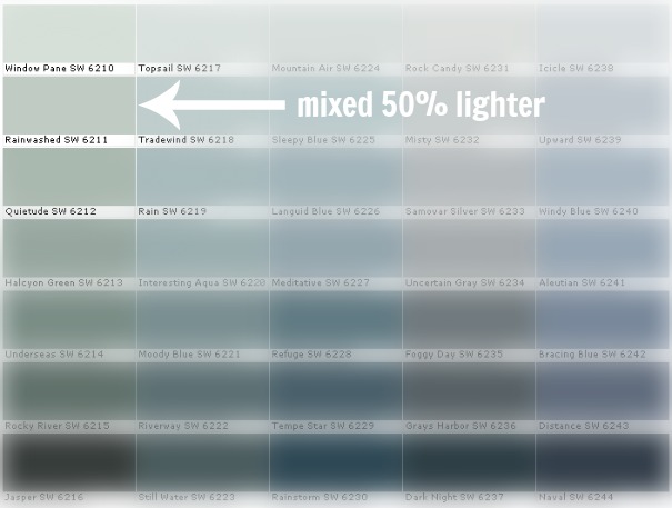
And for the color we ended up using above our board and batten wall … Sherwin Williams Rainwashed mixed 50% lighter in Glidden eggshell paint.
And tell me, how do you pick your paint colors? What shades do you think we should go with in this old Key West conch house? We want Key West charm, without it being Key West tacky, ifyouknowwhatImean.


Kelly @ Corner of Main says
Good luck! I love that last inspiration photo. I know you guys are going to make the perfect choices!!
Karah says
I guess the best part is we can always change it if at first we don’t make the perfect choice, right!??! 😉
karen@somewhatquirky says
The pickled walls in that first picture are pretty cool – but I’m in love with the last room! Good luck to you!
Karah says
We are totally two peas in a pod. I am in love with that last room, but Joel … notsomuch. He thinks it’s too rustic for resale, and he might have a point. We really loved the first look when we saw it at the houses open house.
Candy says
What color is the yellow kitchen
Karah says
Hi Candy – It’s 8171 Orchard Ladder … a Martha Stewart color when her colors were at Sherwin Williams. I hope that helps!
Betty819 says
Great information..BM has a color consultant on staff. I have seriously thought about hiring her for an hourly consultation. Has anybody ever used a paint co. color consultant before and what has been their experience? Our living room/dining rooms are Manchester Tan. The sunroom adjoins the dining room. I’d like to go with something like Key West or tropical color scheme in sunroom. Would I be wise to chose something from the blue/green/teal color and accent with coral and another color.(probably white) It now has light beige wall to wall carpet which was installed by previous owner when he put this house up for sale in 2005. Love the carpet but not in that room. It gets soiled too easily. I’m thinking about tile or hardwoods/lamnate. The sunroom is on a poured concrete slab built in late 1970’s. It has baseboard heat in there. The sunroom is now painted BM kittery green..I’m tired of that color. What other colors would go nicely in the Key West or tropical colors?
Karah says
I LOVE the idea of going blue/green/teal with white and coral accents. I think hardwoods/laminate would also make it feel more sunroomy … I could see how carpet would be hard to keep clean in there. Or, is the concrete slab in good shape? I’ve never tried it but maybe you could just stain the concrete, it might be an economical option. We had a sunroom off of our living room in a previous home and the color we used in there was Olympic 251-3 Spring Waterfall, it’s a nice shade of blue. I’ve never heard of using a color consultant before, I think if you have a few sample pots mixed up you can get a good idea of what color will really work for you. The tricky part with a sunroom is the different light that comes in all day, so you might want to live with the samples a few days to make sure the shade is just right all day. But, if you use the consultant, I’d love to here how it goes. 🙂
Polarity (@PinkPolarity) says
I hired the color consultant at BM. It was a good experience, since I want to paint my new house a bunch of colors, don’t terribly care about between-floor continuity, but getting the right undertones can be tough (especially in anything yellow!). In the end (well, we haven’t painted everything yet but know what we’re doing color-wise everywhere in this house) I liked some of her ideas and disliked others. She picked BM Navajo White for my office (I’m a bright color girl and whites and beiges baffle me b/c it’s so hard to see the undertone until the thing is on the wall), it looks good and warm, and I never would have thought of it, I’d have been faffing around with whites forever. She was less successful with the bright colors (I ended up changing all her suggestions), perhaps because so few clients request them?
Mary Decker says
I’m with the light/medium teal pallete with coral accents, mostly because even opposite with a light /medium coral as your main colors and teal as accent, it would still look good. I like the idea of a darker, rugged looking Hemingway feel floor, how dark depending on how dark you go in the main colors. I think it would add character, and you definitely could not go any kind of beachy with flooring like that. E
bnlynn says
Karah ~ First off, I am LOVING your new house and love watching the progress you are making. LOVE YOUR BLOG! So now that I’m done gushing over you, might I ask about “mixed 50% lighter”. I’ve never heard of mixing a paint color lighter! [awesome] Now I have a zillion questions. Like 1) do you first look to see if a lighter shade of a color you like exists? If not THEN have it mixed lighter? 2) How did you know to go 50% lighter? Oh my… I think you’ve opened a whole new world for me!
Karah says
AHHHH!!! I LOVE your comment. 🙂 The whole 50% lighter idea is new to me, too. I had found the Rainwashed color in a Sherwin Williams color palette book so it was with other suggested colors, and not on a strip with varying shades. I loved the color, but was pretty set on having lighter, almost ‘barely there’, colors on the wood slat walls. I had basically accumulated all of the paint chips in shades that I liked and hadn’t found anything else that I thought was just right. So when I went to have a sample pot made for the Rainwashed I just asked if they could make it lighter and they can do any percentage you tell them, and basically it reduces the amount of tint they add by that percent. I had a sample pot made in 50% and also 75% lighter. If you had a color on a paint strip I imagine this is similar to just picking the lighter shades. Thank you so much for reading, keep the questions coming!!
Linda @ it all started with paint says
What? Joel’s already talking about resale? 🙂
Linda
Karah says
We’re always thinking of resale … no settling down for us yet! 🙂
Betty819 says
It’s been almost 7 years since we painted and the samples were already mixed up. Are you saying if they don’t have a sample in stock, that they will mix up a sample can/jar for you at cost? I think I read somewhere that the samples come in cans now, instead of small jars. and they might be a pt. size? As soon as we get a free day, I’m heading to BM store.
Karah says
I’m not sure if BM will mix small sample pots but both Lowe’s and HD sell small size options (about one cup) for about $3. For reference, I was able to paint the entire area above the board and batten wall with one sample pot. Have fun!
Mac says
The whole kitchen is very welcoming. I especially love the ceiling. That is too cool.
Carrollton Water Damage
Ashley@AttemptsAtDomestication says
Great tips! I’ve actually been having painters remorse about a few of my rooms…
Em Hoop says
I pinned your yellow kitchen. Love it. Found your blog through the item you wrote for Brent Riggs. I need to paint outside of my house. Maybe use a darker grey and mix it 50% lighter. Great idea. Thanks.
Bonnie says
We used the same Rainwashed in our living room and half bath!
I take a slightly more scientific approach to paint, but I love the idea of touring open houses to see what’s selling.
http://bonnieprojects.blogspot.com/2012/08/choosing-paint-colors.html
Mary O'Brien says
Beware the new light bulbs (eco friendly), They changed my beautiful blue (Upward SW – see chart above) to icky green gray.
Karah says
hmmm, thanks for letting us know, I”ll be curious how our new LEDs change our SW Rainwashed.
David says
im curious in your first house what colors did you paint your ceiling??
the only reason why im asking is cause I like the colors you chose im thinking of doing the same colors in my house
Karah says
We have always just used a stock white, nothing tinted, but we don’t buy the cheapest option because it tends to be duller/grayer. Currently we’re using Behr Pure white Ceiling, it is a flat finish. Happy Painting!
Rachel Waldron says
These are fun ideas and it is kind of you to share your methods. However, I would not necessarily say that this is picking colors “like a pro”, because this is not how pros do it. I’d be happy to write a guest blog that does cover many of the basics of how professional designers select interior paint colors for a home, if that is of interest!
gitcalgary says
What a welcome suggestion Rachel! I tried not to get my bee in a bonnet when I read this post as it is titled, “How to pick paint colors like a pro.” I know the tips listed above are ones that I would never share with my clients. I guess it’s all in the definition of ‘pro’.
Karah says
Thanks so much for the comments Rachel and gitcalgary! The post includes my own strategies and links to great paint picking articles by industry professionals. There are so many different resources out there, I’m happy to share what works for me and what I find that I think is useful.