This post may contain affiliate links which won’t change your price but will share some commission.
The cat’s out of the bag. I painted our front door.
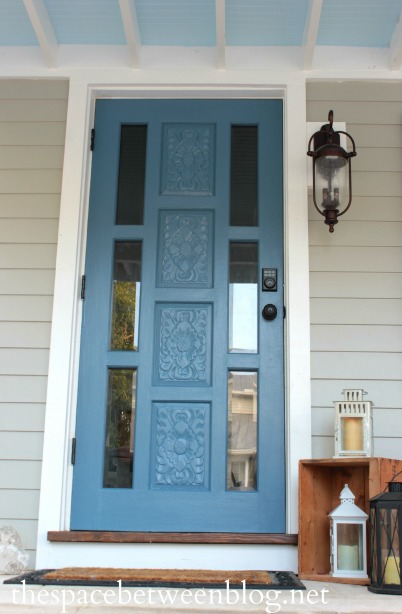
The color is Martha Stewart Blue Suede color matched in Behr Exterior with a satin finish.
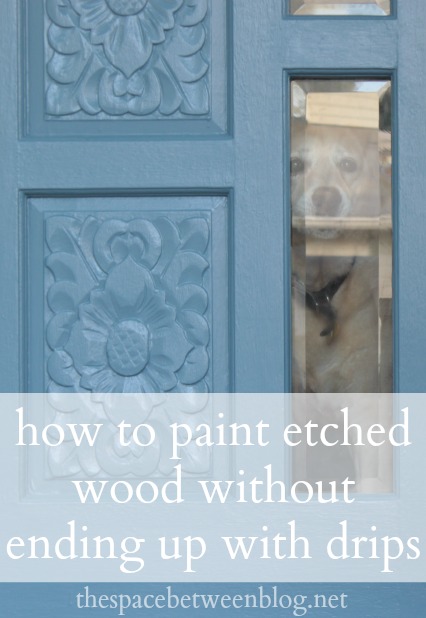
Here’s a close-up of some of the etching detail, there are four panels with the same design.
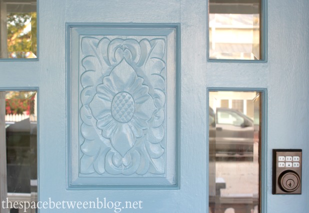
To be totally honest, that design isn’t one I would pick out if we were shopping for a new door, but in our effort to work with and enhance as many aspects of this house as we can without just tossing them aside we’re choosing to try to resurrect this solid wood door to its glory of yesteryear.
Drop ceilings have got to go, but solid wood doors, even with etching that isn’t necessarily my style is totally workable for us. You might choose differently.
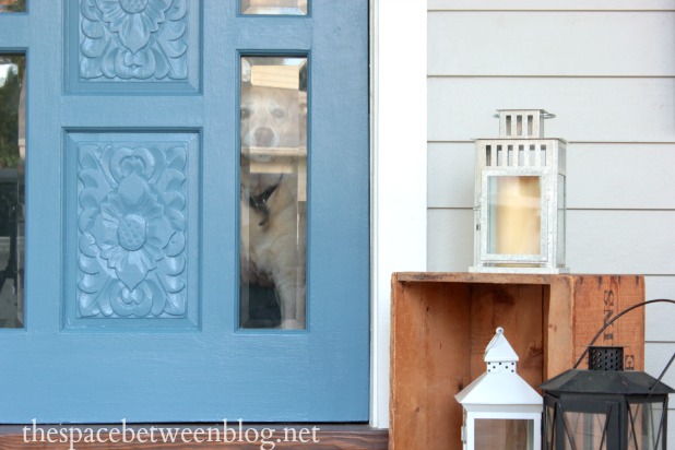
I shared all of the details about replacing the six plastic panels with beveled glass and our plan all along was that when the glass arrived we would remove the hardware and plastic panels at the same time and paint the door while she was nice and bare. I had already ordered the hardware, more on that soon because I truly believe that everyone needs a self locking door, and bought the paint so when the glass arrived we were ready to go.
As for picking the color, I’ve acquired this habit of soaking up inspiration as I’m walking around Key West. We picked the exterior paint color because it is the color of a local hotel and I’m thinking of making a sign that says “it’s a Key West thing” because that is a totally normal explanation for things in our house now.
It’s kind of a way of saying that anything goes, so I didn’t feel any pressure to fall into some sort of norm with the paint color, it was just a matter of picking something that made the house feel how we wanted it to feel to passers-by.
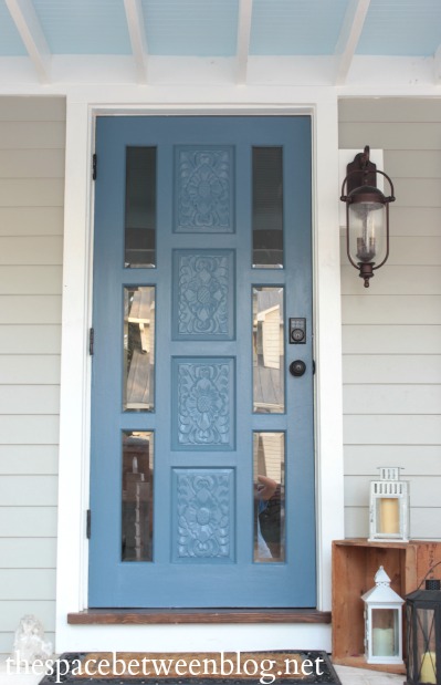
I wanted the color to be fun without being a joke. I wanted it to be sophisticated without being stuffy. Basically I wanted the right combination of quirk, charm and class.
Whether or not I accomplished that is definitely in the eye of the beholder but I found myself drawn to navy’s and dark blues a while back and I just couldn’t shake it.
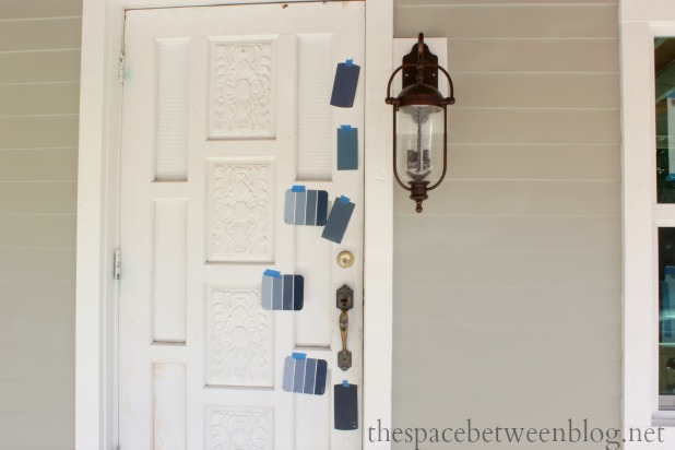
I especially liked the look of the darker blues with a gray house. So after a quick “you’d be OK with me painting the door a dark blue, right?” to Joel, which solicited a response of “red would be fun” to which I replied “been there, done that” (here) I snagged a bunch of blue paint chips and started narrowing it down.
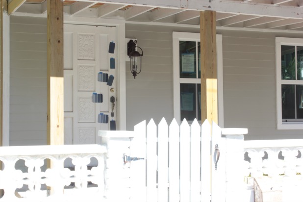
I immediately knew I didn’t want to go too dark because it would look black from the street.
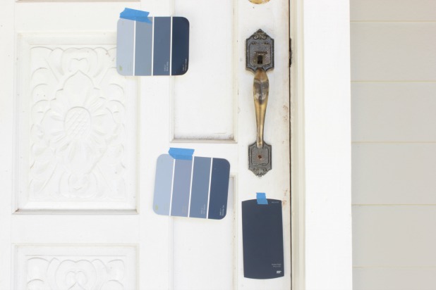
So the one right below the door handle was eliminated. And for some reason I couldn’t see anything but purple when I stared at the one on the top.
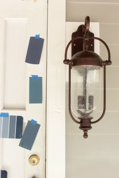
And the multi-colored chips were just not speaking too me. I thought the darkest color on each was too dark and the one next too it just wasn’t right. So pretty quickly I had it narrowed down to two Martha Stewart colors, the one I ended up with and another called Mariner.
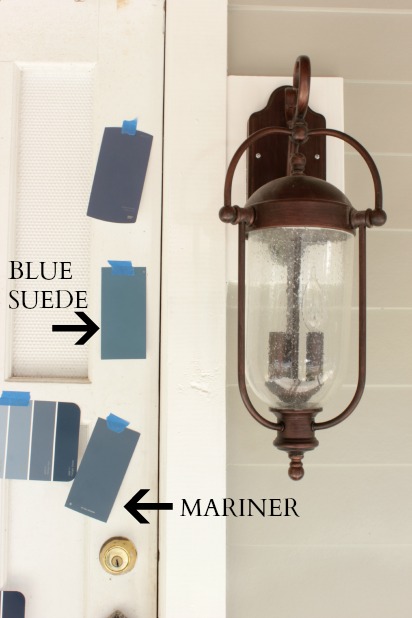
I was really leaning toward Mariner up close but as I walked up and down our little street checking them out from afar and all different angles the Blue Suede struck me with just a little more “color”. It’s hard to tell from this picture, but what is evident is that I haven’t made any additional progress beyond this little front porch.
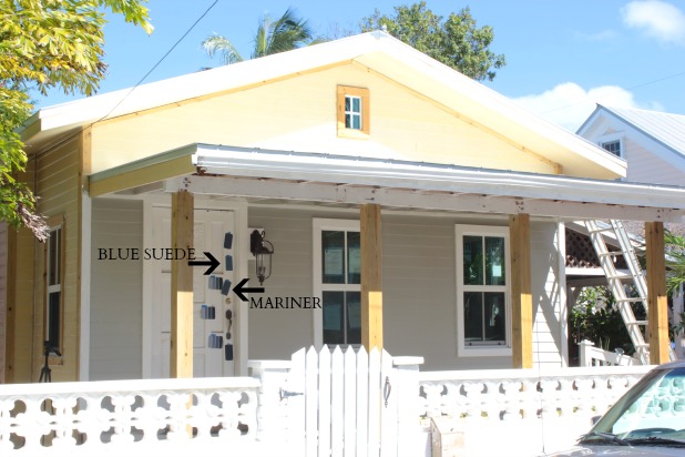
So Blue Suede it was, and since it was on the darker side I opted for tinted primer as well, and the Home Depot was kind enough to tint an opened gallon of Kilz I had with less than 1/2 gallon remaining when I purchased my quart of front door paint.
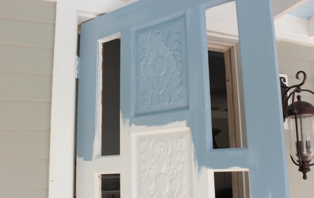
The paint specialist made a point to tell me he tinted it just slightly lighter so it was easy to see the difference when I was painting over the primer so I didn’t miss any spots. I thought that was smart.
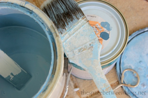
I stuck with just the angled brush for the whole door and kind of stippled into the etching and then brushed over it to smooth it out. The drips from previous coats reminded me not to use too much paint around those areas.
The whole process of stippling into each section afforded just enough time for paint to dry and I could go back and cover up any random streaks so I didn’t actually have to go back to do a complete second coat of either primer or paint.
I would stipple one etched section, then smooth out the paint, brush in the direction of the wood over a few of the flat sections, and then the light coat of paint over the etching was dry enough to go back and stipple more where needed, smoothing out along the way. Then continuing in the direction of the flat wood grain sections, paint a few flat panels and move onto the next etched section. The entire process went pretty smoothly from the top to the bottom of the door.

I’m really happy with how it turned out, we have never had a blue front door so I’m happy to have something new, and since I was thinking of going ORB for the hardware finish I’m glad the Blue Suede is not so dark that it all blends together. All of the dark blue doors I had seen had brushed nickel finishes so I was just crossing my fingers the whole look would come together.
I’m thinking the door is the fun and the hardware is the class and hopefully I can get my act together to get the random church pew/rocking chair stack in order soon so the entire front porch can get into the fun yet classy act.
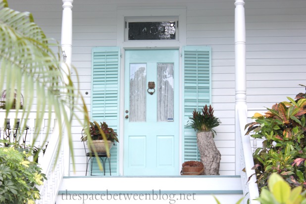
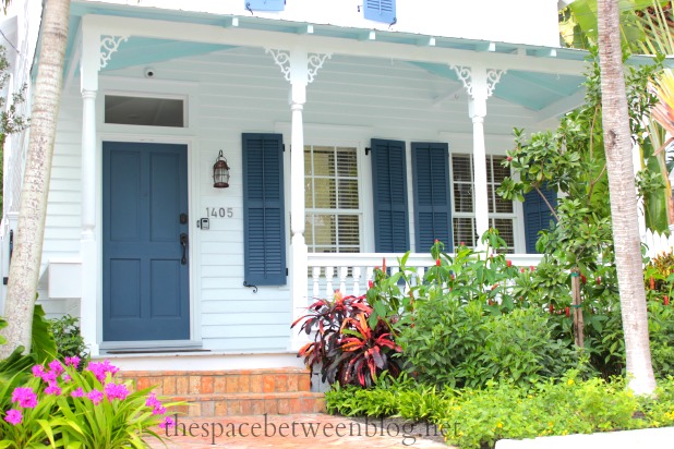
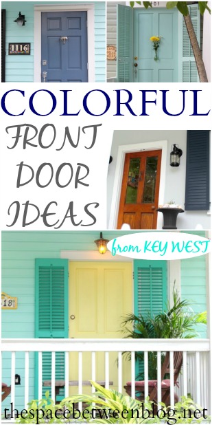
As for my Key West front doors of inspiration, I was really leaning in the aqua direction for quite a while.
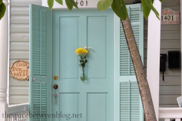
I might just be in love with the bud vase on this one.
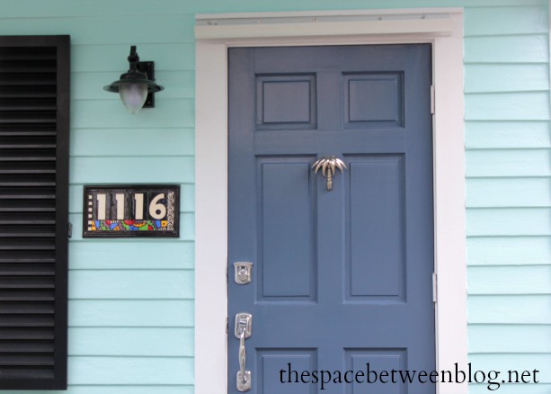
And then I saw this little intro to the navy world with aqua siding and an awesome palm tree knocker.
I think the white and navy combination is just really classic. And I might just trample someone if I ever find that light in real life
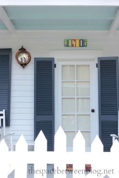
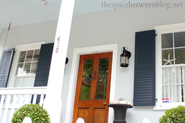
This house was just recently remodeled and proved that the navy/orb combo had a chance.
I was always somewhat considering trying my hand at stripping the front door because I do think a natural looking door is an eye-catcher. But the idea of stripping around all of the etching drove me to drink paint.
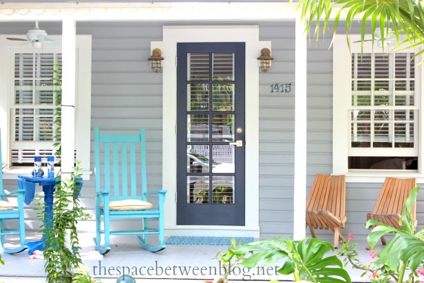
And I walk by this house pretty regularly and after a few times it made me realize I didn’t have to give up the aqua idea all together. Bringing in those “funner” pops of color in accessories could fulfill the desire without having to commit to actually using it on the house. The spray cans of paint on the table appear to be proof that I caught a pretty recent little table makeover and I’m loving the combinations of blues.
And if all you want is fun, there is always this color combination, which I actually love, just not for our house right now.
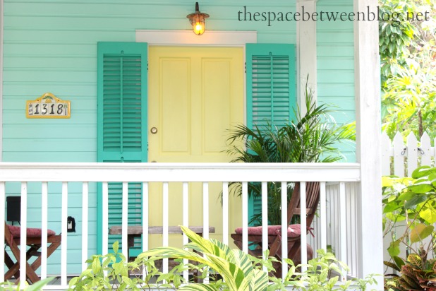
But it definitely makes me smile.
So tell me, how did you choose your front door paint color? Did you go for fun or classic or a combination? I’ll admit, after I had the door all nice and clean I briefly considered sticking with white, white is a color, right?
And, if you’re looking for more you can see how we updated the door with glass panels, how we updated the porch with new siding and how I learned how to use a paint sprayer with a little help from my friends.


cassie says
so fun! i think you should paint the porch ceiling aqua! i love that look with white navy and a touch of aqua in an unexpected place!
Karah says
but I just painted the ceiling blue 🙂 but I am looking for just the right aqua to paint some accessories for the porch, do you know a good one?
Hanna says
I think it looks amaing! The door might not be your style but it is totally mine, I think I drooled a little on my monitor. Plus blue is also my favorite. AND the porch ceiling looks amazing as well!
Karah says
hahaha, drooling is totally fine 😉
Gina says
That looks great! I love the glass panels in the door so the pups can see out!
Karah says
Thank you!
Leesa b says
I think I would have tried to strip and stain the looked of aged driftwood. I love the way that looks and those carved details would have been cool! Your color combo is nice too!
Karah says
I seriously considered the stripping, maybe I’ll try that aged driftwood look on the inside of the door … or on the back door that we have that is very similar. 🙂
Paula kosko says
I love your color choices! …. happen to be tooling around the conch on bike looking for it every am. One of these days it will be a fun surprise to come upon it.
Karah says
Oh, how fun! Now I’m going to be checking out every biker … and let’s just agree now you’re not going to judge us by the amount of stuff we still have in our sideyard. 🙂
Erin says
I swear Karah, I am living vicariously through you. I am such a blue fan, Navy, Aqua, Turquoise. Loving that one house with the Pam tree door knocker. Oh my. Your house is looking great.
Karah says
I am really hoping to bring the lighter blues into accents on the porch. I’m so glad you’re enjoying the transformation.
Kendra says
Looks fabulous! My husband would love that door 🙂
Karah says
thank you so much!
Hi, I'm Traci. says
Karah you did a great job of picking a fun yet classy color. The glass makes all the difference.
Traci
Karah says
Thank you!!
lynn cockrell says
Karah, the color you chose is wonderful. It is past time to paint my front door. It is now a very peeling red. Seeing your door makes me think blue!
Karah says
Thank you!! It felt like a bit of a stretch for me but I love it!
Laurie says
Your Tip Me Tuesday link is incredible this week Karah! In fact, my readers would love to bookmark it in their craft rooms. Did you know that if you upload this blog post into your Tip Junkie craft room using at least 2 images, 2 steps, and blog post URL then Tip Junkie readers can favorite it which instantly bookmarks it so they can find it later. {Whoohoo!} ~ Laurie {a.k.a. the Tip Junkie}
http://www.tipjunkie.com/post/how-to-add-a-craft-room-project-on-tip-junkie/
charlie benedick says
If I took a picture of my front door would you tell me what color to paint it?? Help!
Karah says
Sure, I’m happy to give you ideas! Honestly, walking around my neighborhood worked really well for me to narrow down what I was really drawn to.