This post may contain affiliate links which won’t change your price but will share some commission.
It took longer than usual because I can’t stop staring at the view, but we’re officially off and running with projects around here. And it turns out gathering quotes for the kitchen project is a good way to familiarize myself with new streets and neighborhoods and learn that many a dirt road actually leads somewhere good. 🙂
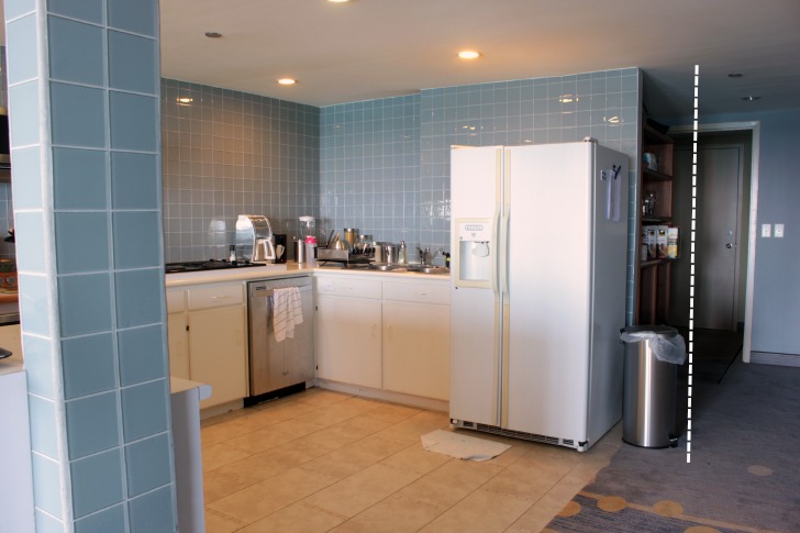
So let’s start by looking at the current kitchen a little more up close and personal, because who doesn’t love an overdose of blue glass tile, proving you really can have too much of a good thing.
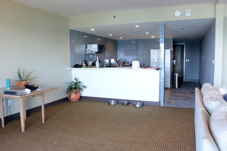
It’s true, I actually do like the tile, but there is just way too much of it. And this picture shows you just how much it opens up to the main living space so I really want to make it flow seamlessly from room to room … or area to area, if you will. And that blue tile is just not screaming cohesiveness.
I’m pretty sure the number one suggestion given by many of you here was to remove the carpet and lay a hard surface throughout. Welllll, in a different time we would do that for sure. But I shared some info on flooring here, and pretty much our old lady dogs love the carpet, it’s in good shape, it’s not an offensive color and it’s staying. Love it or hate it, it’s here to stay, so I also need to work with it when considering kitchen countertops and colors to make sure it all works well together.
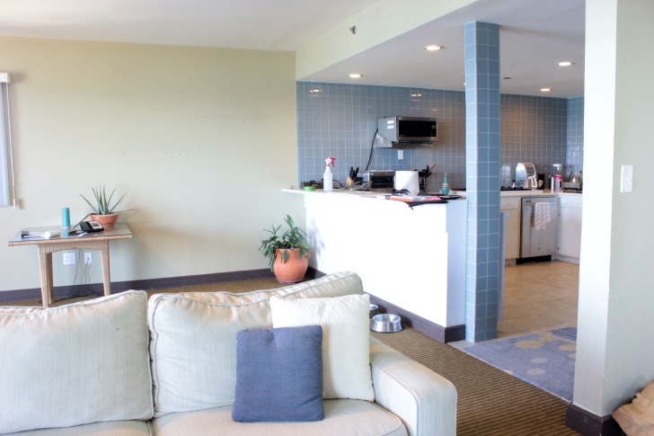
But, I don’t really want brown to be a main color in our end plan (for obvious reasons, I hope) so I’m trying to find a way to have it all meld … leaning away from yellows and creams and more toward grayish neutrals that work with the brown. So, we scoured a warehouse that houses left over tile and wood and random stuff from other projects hoping to find some things that might work and here are a couple of things that caught our eye. I heart little tiles.
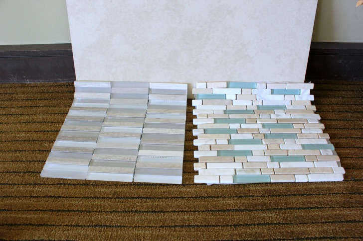
The 12″ x 24″ tile is the kitchen floor tile and here’s a closer look at the carpet that is in the main living areas. (Not terrible, right?!?!) The two mosaic options or possible backsplash tiles. Now, I posted a pic of these on social media and every single person likes the one on the right. With the aqua. And I love it, too. But I think I love the one on the left more. Am I crazy? It brings in the grays that I am so hoping to shift toward. It feels a bit more “classy” maybe, or serene. The one on the right is pretty and fun, but I’m not sure “fun” is the look I’m going for. Let’s just hope I don’t end up with boring instead.
Would it make sense if I say I’d like to keep the freedom to bring color into the kitchen with accessories and not marry the color in the tile? So, I’d like to marry my neutral colored tile and only casually date my more colorful accessories? Making me an accessory slut? Or maybe a tile monogamist. (What am I talking about?)
Honestly, a lot of it will depend on what we find for granite. Options are much more limited, as we’re in the middle of the sea. And since the backsplash is on the wall that extends into the dining room we’ll have to see how that transition turns out. I’m debating flanking open shelving with cabinets at the end, which will create a clear division between the kitchen and the dining room.

But I’m considering all upper cabinets and shelving Phase 2. Mostly because I think I can do it all on my own so it doesn’t have to be part of the bid process for the kitchen remodel. So let’s stay focused on manhandling this awkwardness for now.
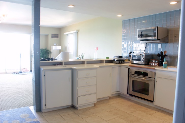
Not only is the cabinet design weird, but we have a microwave hung at random on the wall and a wall oven installed as a range below the counter …
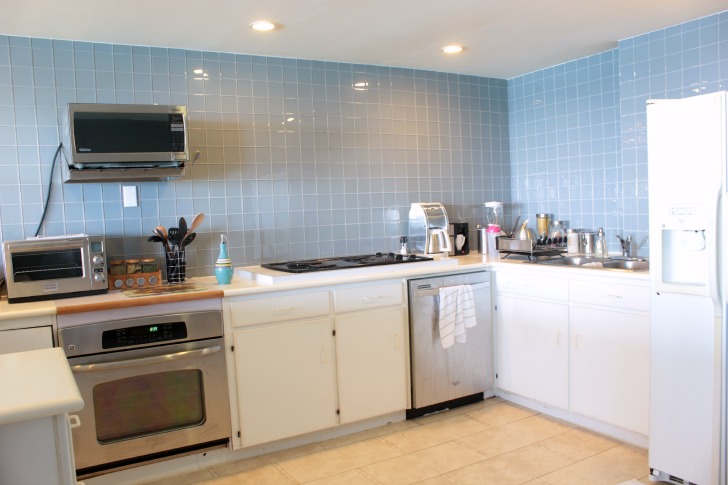
… the cooktop is neither the same size or in the same location as the oven and the dishwasher and sink are installed so close to that back corner all of the storage space below the counter is wasted.
What to do, what to do? Here’s the thought on what we’re going to tackle for Phase 1.
- demolition of all wall tile and cabinets (my job)
- a new range, sink faucet and fridge will be ordered and we will keep the dishwasher as it is almost new and the sink since it is in great shape
- all new lower cabinets will be installed with a new countertop (someone else’s job)
- floor tile will be patched by the bar area after the new cabinets (that will be straight across the front) are installed (my job)
Only 4 line items. Bullet points always make it sound so easy. Who knows how long it will end up taking. The first step is shopping around for cabinets and countertops and settling on a layout that works for us.
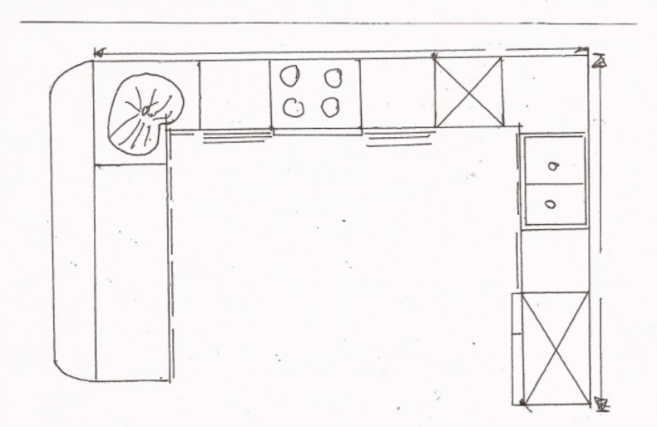
So here’s what we’ve considered so far, I’ll call this first option the budget plan. The layout is basically the same as it is now with the stove pushed a little closer to the dishwasher to allow for sets of lower drawers on both sides. No plumbing or electrical would need to be moved, could totally work, but just doesn’t seem to maximize the space.
Then I got the idea to put the oven and cooktop by the bar which would mean we were facing the view while we cook. Then the sink could move to the left of the dishwasher and we’d have the traditional kitchen triangle that everyone loves. The dishwasher would also shift a little away from the corner so we could fit a corner cabinet in there and not lose all of that valuable space.
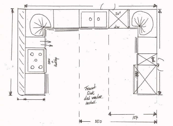
But, that option requires moving plumbing and water for the sink and electric for the stove and costs extra because the cabinet makers would need to build a special cabinet for the oven and also cut out the granite for the cooktop. Also, it turns out we have a sprinkler pretty much right above the bar and putting a cooktop right under that isn’t the smartest idea in the world. More of a lose/lose than a win/win really. :/
Enter Option #3, which we’re hoping turns out to be the best of all worlds. Upon further review, turns out I’m not usually at the stove when I’m in the kitchen anyway (my definition of cooking is clearly a little off), so having the prep area face the view is actually best case scenario. And yes, this is my own hand drawn layout, with my own chicken scratch notes and measurements in inches, feet and centimeters … just to keep you guessing. 🙂
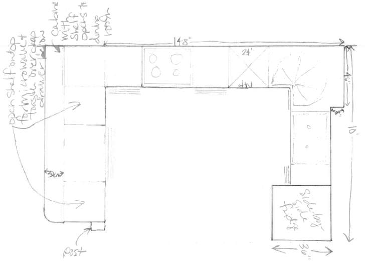
Going from left to right, here is the plan as of right this second, although my mind is known to shift with no advance warning.
- The post is the one that is currently there and covered in blue tile, the row of cabinets will get pushed back a little so the front of the cabinets will line up with the front of the post and there will be an overhang at counter height for seating facing into the kitchen.
- The bar counter will be divided into three sections of under counter cabinets/shelving. The first and third sections will be of equal width and have one open shelf on top of one deep drawer, one open shelf will hold the microwave and the other will hold the toaster oven.
- The center section will be 3 drawers underneath each other, top one for cutlery.
- There won’t be a corner cabinet here but there will be a 1 or 2 door cabinet that opens to the dining room with one shelf.
- Along the wall there will be two sets of deep drawers and the range and dishwasher. The range will essentially be centered between the sets of drawers.
- The dishwasher and sink will both be shifted about a foot from the corner so we can fit in a corner cabinet.
- There will be a 2 door cabinet for the double sink and to the right of the sink (and the left of the fridge) there will be 1 pull door with shelves.
- That wall will be extended about 1 foot to accommodate moving the sink and adding the extra cabinet.
Right now that wall behind the fridge ends where a little hallway begins and the opening to the hallway is wide enough that we can steal about a foot from it for this new plan. And what will happen behind that wall and in the little hallway … we’ll call that Phase 3. Pantry maybe? Place for me to sit and hide when my measurements prove incorrect and the new kitchen plan doesn’t work? Let’s hope not.
So, that’s the latest. We have two bids and are awaiting a third. Before any of this plan gets put into action, whoever we hire to make the cabinets will come and take their own measurements. ‘Cause I just can’t be held responsible for that task. Ever.
I’m setting the over/under line for completion of Phase 1 at 3 months. And as I type that I think 4, but am hoping for 2. Have any thoughts on the plan? Things I should consider? Change? Add?

Linda Lou Huiskes says
Hey Karah, have you been to the two granite places in Alto Vista?
Karah says
I know where they are, Linda, I just have yet to get myself there. Which is funny, because they are like 5 minutes from home. hahah
Linda Lou Huiskes says
If you would like me to go with you, let me know. I know they don’t speak English there 😉
Karah says
Ahhhh, we should do that! I want to go back to the beach, too, although I haven’t made a single thing with my previous finds. 🙂
Linda Lou Huiskes says
Let’s see if we can go to both next week. Today you have to go into town for “Dia di hymno and bandera”. I will walk in the parade this morning with +800 others. There will be all kind of small markets and festivities in Oranjestad today. Have fun!
Carmen says
Hi Karah- I enjoy your blog and all the pictures and remodeling and things, but I do have a question or two. This newest place in Aruba, is an apartment that you and dear husband, are renting, right? Then, why are you spending money on this remodeling? Is the landlord paying for or going to reimburse you for the cost, because it’ll be a much nicer apartment, once you’re done with the remodeling. What’s happening with the house in Key West?
Karah says
Hi Carmen!! We’re keeping the house in Key West, we see ourselves back there one day. And the exciting news about the Aruba apartment is that it’s owned by my husband’s employer and they know it needs updating. I shared the details after all the pictures in this post, https://thespacebetweenblog.net/aruban-apartment/.
Linda Chin says
I like The subtle ness (word?) of the tile on the right. I agree with you on this for sure.
Karah says
totally a word 😉
Ellen says
Love the tile on the right! Love visiting aruba threw your posts! (wishing there where more posts!) Like Carmen, I was wondering the same. If you are renting is apartment in Aruba, is the landload allowing you do to renovations? I kind of find that weird that he would be letting you do renovations. Can’t wait to see the pogress in the kitchen! Please send some pictures of that view! I am going threw withdrawls!
Karah says
I wish there were more posts, too, Ellen!! I’m just settling into real island pace and taking it all in stride, and enjoying the view along the way. 🙂 The fun part about this apartment is that it’s owned by my husband’s employer (I share more details on that here, https://thespacebetweenblog.net/aruban-apartment/). But, when we moved to Curacao we actually negotiated a lower rent to use that money toward improvements to the house … that’s just how we roll. 🙂
Kim H says
At first I thought the stove looking out at the view to be the best plan, but after I read plan 3 and pondered it a bit, I think you are on to something. Be careful with those greys! I’ve tried it in a couple different spots in my house and ended up painting over it. I just could never get the “grey” right. It was either too blue or brown or not quite right. I hope you have better luck than me. 🙂
Karah says
Ack, that’s my fear, Kim. I’m leaning to such light grays that they really look white unless compared to something white. But we’ll see. And I had the same thought process about the layouts, hopefully it all works out!
cassie @ primitive & proper says
option 3 and i think you should go with the tile that YOU love.
Kelly @ Eclectically Vintage says
Hmmmm, is this why you invited me? Manual labor?! The carpet is fine – you can always add rugs over it to minimize the brown. I like option 3 and I love the more neutral tile too – you can accessorize to add color and never get bored. Maybe some of those pallet house dwellers can do the grunt work.
Karah says
hahaha, exactly, don’t forget to pack your work clothes 😉
KathleenC says
I like both tile options… but can see how the one on the left is subtler and will allow more freedom in choices of accessories for both the kitchen and open room. I’m not sure I understand where you’re using them though… are you ripping off all the blue tile including the post and replacing with the mosaic fully? Will you keep some of the blue anywhere? Will you paint walls and just do backsplash height mosaic tiles?
Karah says
All of the blue tile will go, KathleenC, and I’m thinking just a normal sized backsplash for the new tile. My current thought on the post is to wrap it in wood to make it look like a beam. Hopefully that works. 🙂
jenny says
Question! If you are planning on putting in top cupboards, why change the tile if you like it? I agree it’s a great tile but too much of it. By the time you put in top cupboards, shelving and build in the oven, and microwave properly, reposition the cook top, there will only be a smaller ( more normal) amount of tile showing.
I’d be spending the money to make a lot of more of the preparation area facing that view. You have the space to add storage ion the dining area side to bring it out further similar to a large island off the wall. But that’s just me and my ideas, and I do think differently to a lot of people when it comes to kitchens 🙂
Having said all that, like you. I prefer the tiles on the left.
Karah says
Hi Jenny! I’m not planning on any upper cabinets, only open shelves. And I agree, I am definitely trying to push the bar/prep area as far back into the dining area as I can without leaving the post alone in the middle of the kitchen. hahaha, always something to work around. 🙂
txvoodoo says
I am 100% with you on the tile on the left. I like small tile too, but if you’re putting it on a big space, you have to be careful that it doesn’t get too busy! The one on the left is, as you say, serene, and gives you flexibility moving forward.
And plan 3 looks good!!
Missy says
Choosing the more neutral tile will make someone from the future appreciate you. Timeless. The bright colored tiles are cool, but they are akin to the baby blue bathrooms from the 70s.
Karah says
I am hoping the other will be more timeless, Missy, that’s a great way to look at it!
Wendy says
Hey Karah
Seems like I’m with the majority on the tile too! I have something similar to the busier tile in my kitchen (love it) but only as an accent in white subway tile. I’m taking Kim’s suggestions to heart about the grey too as I’m contemplating repainting my tiny house…but I really don’t want to paint it twice;) Last point…love the view, but I’ve never been a fan of having the stove top by the sitting area…likely because I spend so little time cooking it’s just in my way! lol
Can’t wait to see the process!
Karah says
hahaha, sounds like we have similar cooking habits 🙂
Kelly says
I agree with your decision to use the more neutral tile. In the kitchen have you considered the addition of toe kick drawers. I installed one below my triple drawers and use it for all my foils, baggies and wraps. I have a friend that uses hers to store the large meat platter that never seems to fit into a regular depth cabinet. I would also suggest that as you look at the corner cabinet stick with the simple lazy-susan style…many “modern” cabinet companies offer a style that pulls out into a kind of L shape, but I have found that more items fall off and are difficult to reach, who knew the 1960’s simple style was better 🙂
Also you might want to consider a narrow pantry a narrow swifter/mop area at the hallway end of the frig. it would be the depth of a box of cereal or soup/vege can…it doesn’t take up much space. My mother redid her kitchen in the 80’s and was able to “convince” the cabinet maker, it came in handy and while it started as a broom closet it is now fitted with shelves and holds pantry basics…If not at the frig end how about a build where the post is located? Your light comes from the wall of windows not the hallway…Just some random thoughts…LOVE your Blog!
Karah says
I LOVE these ideas, Kelly! Funny enough the toe kick drawers and narrow broom closet beside the fridge are on my to-do list for the Key West kitchen. I think both of those features would be so fun, I was thinking pull out dog bowls in one of the toe kick drawers. 🙂 For this kitchen, our options are so limited with what is available here on the island and the more customized the options the more the costs skyrocket. But I need to find out about this corner cabinet stick and see how it works. Thank you so much for the great ideas!
Barb says
I would choose the tile on the left. I like the one on the right but think it would look dated in a few years where the one on the left would be more timeless because of the neutral colors.
makinglemonadeblog says
I have no opinions on anything because I know you’ll choose well, I’m just binge reading all about the move and SO happy for you. Having the owner PAY for updates, living in paradise, and spending your days DIYing?! Wonder if Joel needs another wife to help you out? J/K. Maybe I could nanny the dogs? XO!
Karah says
Hahaha, or maybe I just need a sidekick. 🙂 Come on down!
Karah says
That does make sense, that’s the kind of corner cabinet we have now and it’s awesome. I bet that would be the perfect layout for a house full of kids!!
Lisa says
Likes on the drawn plan #3. I like both tiles, I know, no help whatsoever. I cannot wait to watch the transformation. Are you going to be able to work ‘at will’ or do you have a noise ordinance in your apt complex? From past posts, you are no stranger to burning midnight oil.
Karah says
hahaha, lisa! I will definitely have to keep any loud work between the midday hours … I guess when I get the late night urge to be productive I’ll just have to get crafty or something. 🙂
Patti J says
We did gray and it felt like cement. We added in some tans and landed with greige, which was perfect. It looks great with bright accents like blues (I hear you have some tile) or yellows… perfect complement to your view. What about doing a reclaimed wood wall along the far wall of the kitchen and into the dining room to tie them together? You could find or do a driftwood color that has both browns and grays. Also, if you’re redoing the cabinets, why not keep the stove and microwave but build them both into a usable wall unit along back wall of the kitchen? Save the money so you can use it on something else. Just my thoughts. 🙂 Thanks for sharing your project. Can’t wait to see the progress.
P.S. My last thought, would reed/bamboo window shades work? They may be too heavy for such big windows.
Karah says
Hi Patti – I love the idea of a reclaimed wood wall, will have to try to work one in somewhere! And I appreciate the input on the grey, finding just the right shade is proving difficult! And I have gone back and forth about building in the oven and microwave and doing a separate cooktop but just never came up with a layout that felt right with that tall cabinet. As for blinds, we’re looking into a solar shade option, something that will just block the afternoon glare but not totally block the view … but we do love the bamboo blind look, so that’s definitely still an option, too!! Thanks for the ideas, it’s fun to hash it all out. 🙂